Customer Service Interaction Metrics That Drive Retention
Track first contact resolution and customer effort to predict who stays.
Retention is the cheapest growth strategy that most customer service dashboards are actively hiding from you. Bain & Company research (via Harvard Business Review) puts the number plainly: a 5% bump in retention lifts profits somewhere between 25% and 95%. Meanwhile, acquisition costs have climbed 222% over the past eight years, so every customer who quietly walks out the door is getting more expensive to replace. And 72% of customers will switch to a competitor after just one bad interaction. Here's the part that should keep a support leader up at night: 56% of them never even file a complaint first. They just leave. This is a measurement problem before it's a service problem. If your dashboard can't tell you which interactions predict departure, you find out about churn the same way you find out your smoke detector's battery died: too late, and by smell.
What the retention benchmarks actually show across industries
Retention averages around 75.5% across industries, but that number is doing a lot of hiding. Media and professional services sit near the top at 84%. IT services runs about 81%. Construction and engineering land around 80%.
Then there's the other end. Hospitality, travel, and restaurants average just 55% retention, which makes sense once you think about how easy it is to book a different hotel or try the restaurant next door. Low switching cost, low loyalty. No mystery there.
SaaS runs its own playbook. Overall annual churn averages around 4.1%, split roughly into 3.0% voluntary and 1.1% involuntary (people who leave on purpose versus people whose credit card just expired). B2B SaaS tends to run tighter, closer to 3.5% annually, and enterprise products should be aiming for churn under 7%. Cross that line and it's not bad luck, it's a signal that your product isn't delivering value or a competitor is eating your lunch.
Here's why this matters before you read another word of this article: a low single-digit churn rate in SaaS and a 45% churn rate in a hotel chain are not the same problem wearing different clothes. They need different leading indicators entirely. Context comes first. Metrics come second.
Why high-volume operational stats tell you what happened but not why customers left
Handle time. Ticket volume. Cost-per-contact. These numbers are real, and they matter, for staffing schedules and budget spreadsheets. What they don't do is tell you whether a customer is coming back.
Here's the trap hiding inside average handle time: shrink it too aggressively and you start rushing agents off calls before problems actually get solved. That's a direct hit to resolution quality, and resolution quality is what keeps customers around. Optimizing the wrong number can actively work against the goal.
HubSpot's State of Customer Service research asked CX professionals to rank what actually matters, and CSAT and retention tied at 31%, with response time close behind at 29%. Notice what's missing. Operational throughput didn't crack the list.
Think of it this way: operational metrics measure the machine. Interaction-quality metrics measure what it's like to be a human being standing in front of that machine, asking for help. Everything from here forward in this piece lives in that second category, because that's where the metrics with an actual, demonstrated link to renewal and repurchase live.
First Contact Resolution and its outsized effect on whether customers stay
First Contact Resolution, or FCR, measures the share of inquiries solved without the customer having to call back. It is about as close to a clean proxy as customer service gets for "did this actually work."
The retention case here isn't subtle. SQM Group research found that 95% of customers keep doing business with a company when their issue gets resolved on the first contact. Ninety-five percent. That's not a nudge in the right direction, that's a near-guarantee.
FCR doesn't just sit there being impressive on its own, either. It multiplies. Every 1% improvement in FCR lifts CSAT by roughly 1% and NPS by about 1.4 points. So improving FCR isn't just fixing one metric, it's pulling two others up behind it, like tugging the top card in a very cooperative deck.
The industry average for FCR sits at 70% (SQM Group, 2025), and the top performers push past that. Worth a pause here on the AI angle: a chatbot can close a ticket without solving anything. Containment rate (the bot made the conversation end) and true resolution rate (the customer's problem is actually gone) are two very different numbers, and any dashboard treating them as the same thing is quietly lying to you. Improving FCR for real usually means digging into why customers call back in the first place, not just training agents to type faster.
Customer Effort Score as a predictor of churn that CSAT misses
A high CSAT score and significant customer churn can coexist — and it's not a fluke. It's a metric with a blind spot. CES asks a different question and often reveals what CSAT obscures: that routine tasks are just needlessly hard to do.
CES asks a different question than CSAT. Instead of "how did that make you feel," it asks "how much work did you have to do." Not warmth, effort.
The research anchoring this metric comes from Gartner/CEB: a vast majority of customers who had a high-effort interaction became more disloyal afterward, while nearly all customers with a low-effort experience said they planned to buy again. Effort, not sentiment, is doing the predicting.
Here's the mechanism worth sitting with: CSAT can stay high while a process quietly falls apart underneath it. A customer can rate the agent five stars for being kind and patient, and still decide, privately, that renewing next year isn't worth the hassle it took to get a password reset. CSAT measures the agent. CES measures the obstacle course.
This shows up hardest in SaaS and other service-heavy businesses where customers keep coming back to support again and again. Each high-effort episode stacks on the last one. CES works best fired off right after a specific task, a password reset, an onboarding step, a billing dispute, not as some general relationship survey mailed out once a quarter.
CSAT's real role: interaction-level signal, not a loyalty forecast
CSAT is a post-interaction rating, usually on a 1-5 or 1-7 scale, measuring satisfaction with one specific touchpoint. It was never built to forecast the whole relationship, and it shouldn't be asked to.
Where CSAT earns its keep: a low score is a genuinely reliable early warning. The signal runs stronger going down than it does going up, which is worth remembering before anyone puts too much faith in a high aggregate number.
And that's the ceiling problem. A great CSAT score doesn't reliably predict a renewal, a referral, or a repeat purchase. Customers rate one interaction highly, then leave anyway, because the broader experience let them down somewhere else.
Top contact centers land above 75% CSAT as a working baseline. The 85%+ figures floating around in 2026 benchmark reports are aspirational for most teams, not typical. CSAT works best as a tripwire: a score that drops below threshold on a specific interaction type, billing, onboarding, cancellations, is genuinely actionable because it's granular. An aggregate CSAT number blended across every interaction type tells you far less, because it averages away the exact detail you need. Timing matters too. CSAT collected right after a resolution captures the interaction itself; CSAT collected days later starts blending that interaction with whatever else the customer thinks about the brand that week.
Response time: where the retention link is real but context-dependent
Speed doesn't work the way people assume. A slow first response followed by a fast fix leaves customers less satisfied than a fast acknowledgment followed by a slower fix. Responsiveness signals respect. It says "we heard you," even before the problem's actually solved.
Satisfaction doesn't rise forever the faster you go, either. It's threshold-based: cross a certain wait time and satisfaction falls off a cliff, rather than sliding down gradually.
On the phone, customer patience for hold times is notably short, and yet industry-average hold times routinely blow past what customers find acceptable. In live chat, customer patience for waiting is similarly short before abandonment rises sharply. Email runs on a longer clock, but faster replies consistently outperform slower ones on customer satisfaction. That difference is wide enough to treat response time as a retention lever, not just a nice-to-have satisfaction stat.
AI's fingerprint shows up clearly here. Freshworks' 2025 benchmark data found AI cut average first response time from over 6 hours down to under 4 minutes. Impressive, until you remember speed without resolution just means customers get told "no" faster. Pair speed gains with resolution quality, or FCR takes the hit instead.
Response time deserves a seat on any retention dashboard, but it sits below FCR and CES in the pecking order. It predicts how an interaction starts, not how it ends.
NPS as a relationship-level check, not an interaction-level guide
Net Promoter Score asks one question: how likely are you to recommend this company, on a 0-10 scale. Subtract Detractors from Promoters and the score runs from -100 to +100.
The growth link is real and well documented. Bain & Company research found NPS explains somewhere between 20% and 60% of the variation in organic growth rates among competitors in most industries, and London School of Economics research found a 7-point NPS increase correlates with roughly 1% revenue growth. That's a meaningful connection, not a vanity metric dressed up in a boardroom slide.
In B2B SaaS, top performers tend to post NPS scores in a higher range, while consumer product companies typically land closer to 30–45, according to customergauge.com benchmarks. Different categories, different ceilings.
Here's NPS's limitation, and it's a structural one: the score reflects the accumulated weight of every experience a customer has ever had with you. One resolved ticket, or one badly bungled one, barely moves the needle. That makes NPS a poor tool for diagnosing any single support fix, even a good one. What NPS can't do is tell a team which interaction type tanked the score last quarter, or hand a support lead anything actionable for next week's queue. What it can do well: track whether a sustained service improvement is compounding over months, feed executive reporting on loyalty trajectory, and flag the Detractor segment for proactive outreach before they quietly become a churn statistic.
How the metrics fit together as a working hierarchy, not a checklist
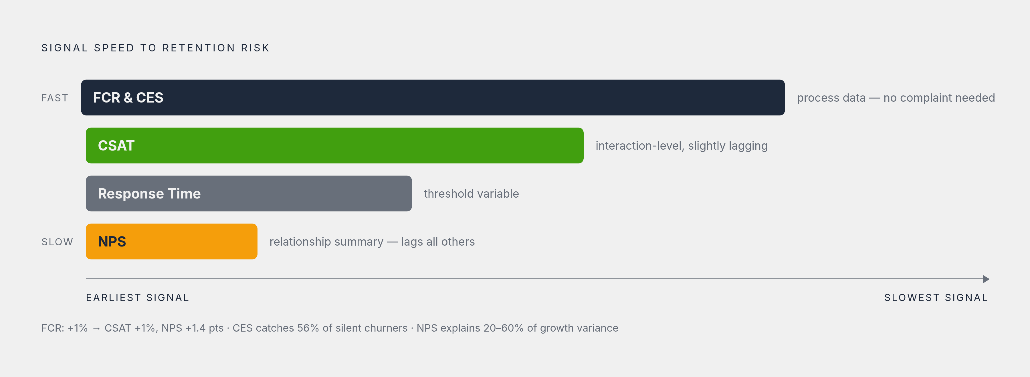
Line these metrics up by how fast they signal trouble. FCR and CES fire at the interaction level and predict near-term retention behavior. CSAT trails just behind them. Response time is a threshold variable, useful but conditional. NPS is the slow-moving relationship-level summary that shows up last, after everything else has already happened.
Used in layers, the hierarchy does real work: FCR and CES steer frontline decisions and process design in the moment; CSAT does interaction-level quality control; NPS checks whether sustained investment in service is actually compounding into loyalty over time. None of them replace each other. Forrester's 2024 research found that "customer-obsessed" organizations grew profit 49% faster and retained customers 51% better than their peers, and that edge comes from running the whole system well, not from nailing one metric in isolation.
There's a quieter warning buried in the retention numbers, too. Recall that 56% of unhappy customers never say a word before they leave. A metric hierarchy leaning only on feedback-based signals like CSAT and NPS will miss a huge chunk of at-risk customers, simply because those customers never gave feedback to begin with. FCR and CES get derived from process data, not opinion, so they catch friction even when the customer stays completely silent about it.
For a team deciding where to start, FCR is the highest-leverage move on the board: it lifts CSAT and retention at the same time, simultaneously, which is a rare kind of two-for-one in this line of work. Add CES next, especially anywhere customers interact with support repeatedly. And resist the urge to build a dashboard that's just a wall of numbers. A handful of metrics, each tied to the right decision, beats a spreadsheet so full it averages the signal into static.